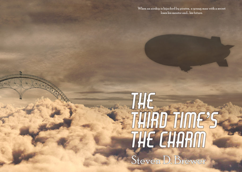
When The Third Time’s the Charm was selected by Water Dragon Publishing, I was invited to suggest ideas for cover art. My initial response was to suggest some of the most iconic scenes in the story. But when I saw the first draft of the cover art, I came to understand better how the covers were put together by compositing stock photo artwork.
We had several rounds of revisions. I saw the first draft and made some comments. Another draft was much closer but had a few elements I thought could be improved upon. But the artist had also come up with a second conception for a cover.
It’s got similar elements, but a completely different kind of feel. It has less dynamic range — it’s almost monochromatic — with a more “modern” font. After some back-and-forth, we agreed that, although it was interesting and had its own merits, it probably wasn’t as eye-catching as the original. So we went with the original.
One thing I realize, as I look at both covers, is how little world building I’ve done as yet. I’ve just finished the rough draft of the sequel and I keep realizing decisions I’ve made (or haven’t made) about the structure of the world. In the cover we selected, for example, is a very long single span bridge. Would such a bridge exist in the world? Mmmmaybe. Maybe not. Each new discovery I make through my writing gives me a tiny burst of pleasure and excitement.
In the alternate, I don’t know what that curved thing is on the back cover. It’s pretty cool, I guess. But what is it doing up there in the clouds? I guess now we’ll never know.
One of my reviewers wrote me to say, “I do really hope you write more stories in your world, because I look forward to finding more out about it.” I look forward to finding out more too.
