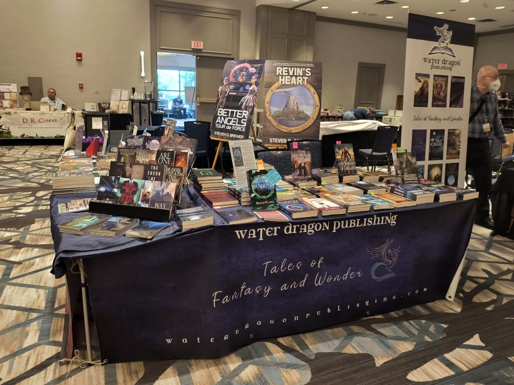
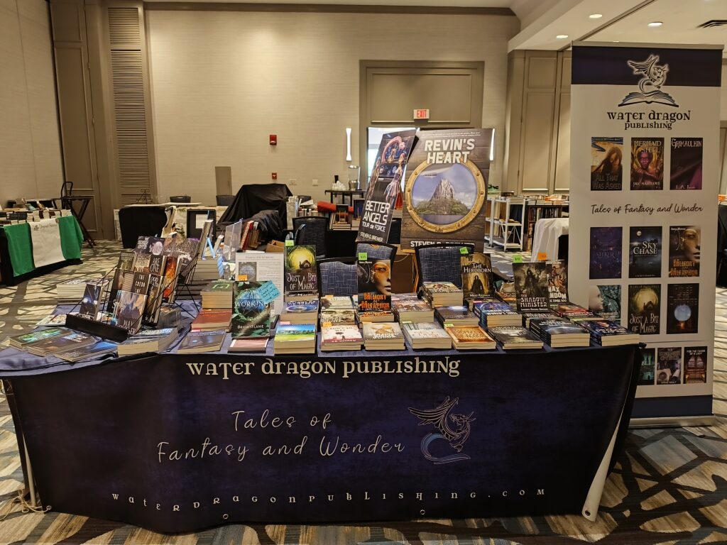
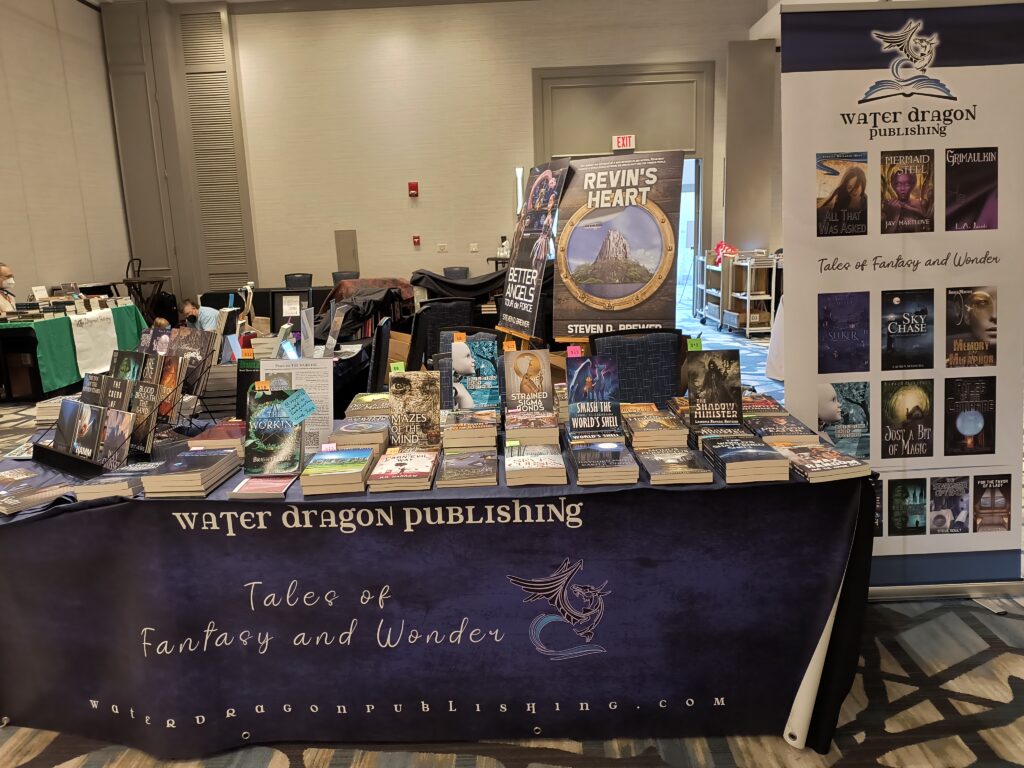
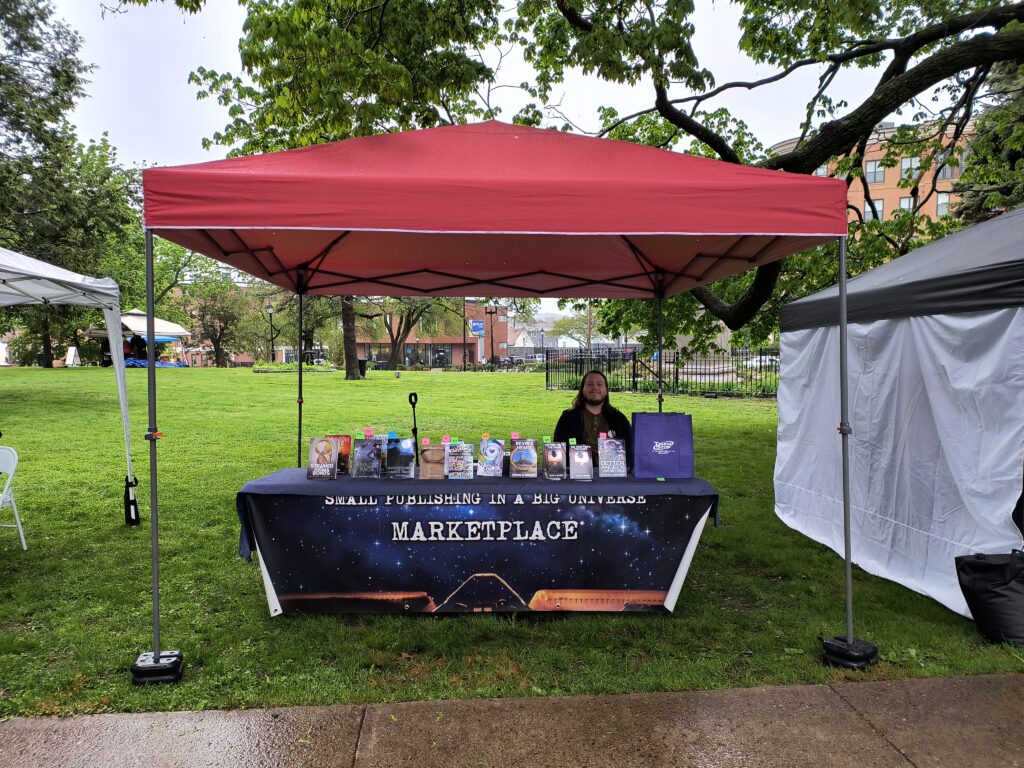
My younger son and I brought books for Water Dragon Publishing and Small Publishing in a Big Universe (SPBU) to Readercon33. It was the first time we’ve tried to sell books at that convention. We did alright. Many of the other vendors said that sales were down from last year, which was a little strange as the number of attendees was higher.
I’ve now run — or helped run — a dealer table at a convention perhaps a dozen times. At most conventions, the dealer tables are much more diverse. Often, there are t-shirts, jewelry, gaming supplies, artwork, etc. But Readercon is almost exclusively book-focused. Since we’re also (almost) exclusively book-focused, it seemed like an opportune moment for reflection on our process: what we’re doing right and wrong. I thought I’d share my thoughts here.
As my first step, I decided to walk around and photograph all of the other dealer tables in the bookstore to reflect on differences between what we’re doing and what other groups are doing to gauge effectiveness and assess what we’re doing right and what we could improve.
It’s hard to make too many generalizations because a lot of decisions are site- and con-specific. In this case, our tables began second along the main aisle people took into the bookstore. The tables made an L with two tables along the main aisle and one at 90 degrees forming an aisle to right. Since people were entering and walking along the main aisle — and couldn’t see our banners at a distance — I put some signage at the end of the table that people would be facing as they came in the door. And, where there was a gap where tables abutted at the corner, I had a small aluminum table I could fit in the gap that gave us some extra space.
I also made some site-specific decisions about organizing books. In general, I put a book in front on a bookstand, a second book behind on a stack of books, and a third book on a taller stack of books at the back. I put the books by attending authors in the front along the section people came to first. I put the rack with the “Dragon Gems” short fiction books in the corner, and I put the anthologies just around the corner in a group. Finally, I tried to put authors with multiple books in a row so you could see book one, book two, and book three in a series in a row. I kept a two-book wide space open in the back for a spot where authors could sign books. And placed giveaway items (cards, ribbons, stickers, etc) in the front. Each book has a colored price tag tucked in between the pages sticking up where it’s easily viewed.
A few observations…
It makes a huge difference for an author to be there. There’s almost no point in having books available from authors who aren’t at the con. And certainly it doesn’t make sense to feature their books. Speaking of which…
I think we may have too many books on display. People seemed to be daunted by the sheer number of titles: we had around 50 Water Dragon titles (spread over 2.5 tables) and more than 20 SPBU titles on one table. It was a cacophany of different authors and genres. People couldn’t decide what to focus on. And, looking at other booksellers that have shelves, we didn’t get many people that would stay to browse, perhaps because people felt self-conscious with us just standing there. Having bookshelves might really help so people can more comfortably browse. I also wonder if we might do better having more books simply spread out on the table and fewer books on bookstands: so the books on bookstands stand out more. Currently, people seem overwhelmed. I think we’d do much better to feature a handful of books: the books by authors at the con and a handful of the newest books. But the others should be much less prominently displayed: people should be able to browse them, but they shouldn’t be set up in parallel with the books we’re featuring. Ideally, they should be in bookshelves. But see below…
We’re limited by the scale of our operation. It would be great to have bookshelves, but we need everything to fit in a volunteer’s car: we don’t have a package truck to move rolling bookshelves like the other book stores. Similarly with respect to signage: it would be great to have some kind of lighted overhead sign, but with only one or two people setting up — and needing to fit everything in a regular passenger vehicle, there are limitations.
Signage: We have banners hanging from the tables. Behind the table, we have a tall standing banner and I bring the covers of two of my books printed on foam board that stand up on easels. Other places have table-top signs, computer displays, or overhead frames with lighting and signs. I think our signage is pretty good — I saw someone taking a picture of my book covers and the standing banner, which made me feel pretty good. Our banners are 8 feet long which is too long when the table is only six feet. It might be worth getting 6 foot banners which will fit better on a 6-foot table, but still look OK on an 8-foot table.
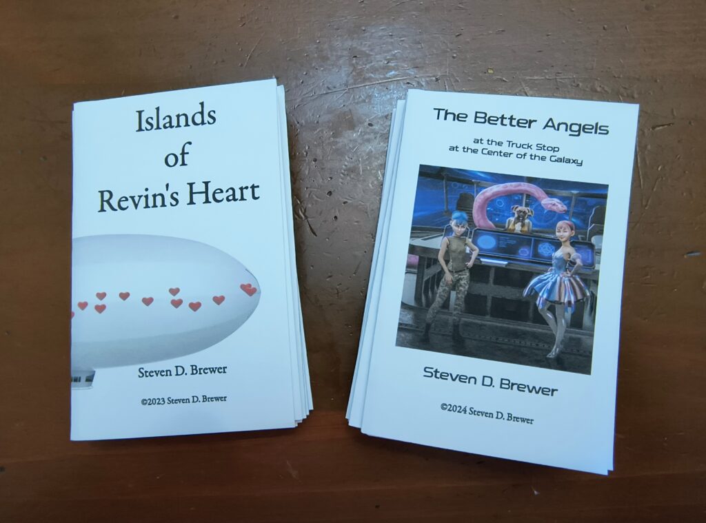
Some of the vendors use QR codes extensively. If we had signage with QR codes, it might be helpful to make it easier for people to visit our websites. At first, I put QR codes on my book covers with the links for Kindle, Barnes & Noble, and the publisher. One guy used them. But with the book covers farther back, behind the table, it didn’t seem worth it. But maybe its worth putting up more QR codes.
I almost didn’t see anyone else using visible price tags on books. I have some inkscape files with price tags at the edges of paper. I print them on colorful card stock, cut them up, and stick them in between the pages of our books. A few groups that had books laying flat on the table (like the Clarkesworld table) had some price tags laying on the covers. I remember at Rhode Island Comic Con, having price tags was really important as everyone kept asking how much stuff cost. I keep meaning to make sure I get enough of each price printed (every time I end up having to write a bunch by hand which is not difficult, but annoying). Just having different colors is good, as it adds visual interest.It would also be good to have a consistent color scheme so that the different colors of tags “mean” something. If we used colors consistently and had a key (e.g. blue for fantasy, orange for scifi, pink for romance, etc). Still, it would be hard to pigeonhole the books since it might also be nice to mark which are LGBTQIA+ and what do you do about “romantasy” and other cross-genre books?
Some groups have various giveways or raffles where people can sign up. This would be a really good idea to get people onto our mailing list. One table had a kind of gumball machine that had little plastic containers with prices — maybe on slips of paper? At Boskone, MIT press had people fill out slips of paper for a chance to win a boxed edition of a beautiful, colorful edition of a D&D book. We need something like that. Alternatively, a tablet computer where people could enter their email address directly might be good. But that might need power.
Depending on how one could set up the bookstore, it might be fun to have some seating. People might look at books longer if they had a place to sit down while browsing. That couldn’t work in some setups, but it might sometimes be possible.
Sometimes, we’ve had some kind of display on the tables. Lisa had a treasure chest once. And Jay Hartlove had a mermaid mannequin for his Mermaid Steel books. I’m not sure it always makes sense, but something that adds visual interest is always worth considering.
The most important part of running a book table is having effective pitches for the books. As people walk by the table, I usually ask people either “Would you like to be an airship pirate?” or “May I tell you about my books?” People are usually amenable to letting me make a pitch. It only works about 10% of the time. But nearly all of the sales I make are directly the result of me making a pitch. If you don’t have some kind of pitch there’s no way for someone to pick your book out from all of the others. I would pitch all of the books except most of the authors haven’t provided a pitch for me to use for their books.